Why Using Data Visualization for Tracking KPIs?
Tracking Key Performance Indicators (KPIs) is essential for businesses aiming to stay competitive and agile. Organizations that can collect data efficiently and analyze it quickly often outpace their competitors by making informed decisions faster. Data visualization transforms complex information into clear, visual formats that enable immediate insight into performance trends and patterns.
The Power of Visual Data Interpretation
Data visualization leverages graphical representations to make sense of large datasets. Instead of poring over endless rows and columns of numbers, decision makers can interpret data intuitively through charts, graphs, and dashboards. This reduces time spent on analysis and encourages proactive, data-driven decisions.
- Simplifies complex data: Visual formats reveal stories and trends that are hard to detect in raw data.
- Accelerates decision-making: Rapid insight means businesses can react to changes faster.
- Encourages creativity: Interactive dashboards empower users to explore data and generate new business ideas.
- Reduces resource duplication: Easier self-service analytics cut down the need for constantly building new reports.
Effective Visualization Techniques for KPIs
Understanding the types of visualizations and when to use them can enhance your tracking capabilities:
- Line and Area Charts: Perfect for showing changes and trends over time.
- Scatter Plots: Useful to identify relationships between two variables.
- Histograms: Illustrate the distribution or frequency of data points within a dataset.
- Heatmaps: Use colors in a matrix to quickly depict data intensity or categories.
- Sankey Diagrams: Display flow and volume, especially helpful in tracking resource or financial movements.
- Candlestick Charts: Widely used in finance to show asset price movements over time.
- Geographical Maps: Show regional performance differences, such as sales or health statistics.
Practical Example: Visualizing Sales KPIs in Excel
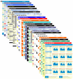
Excel remains a highly accessible and powerful tool for building KPI dashboards. By creating interactive dashboards, businesses can quickly visualize sales performance, for instance:
- Spot seasonal trends for different product categories.
- Compare month-to-month sales growth or decline.
- Identify geographic areas with the highest revenue.
- Highlight underperforming products or regions.
For example, visualizing sales data shows how clothing sales remain steady with small fluctuations, while overcoat sales exhibit strong seasonal patterns peaking in fall and dropping in summer months. Such insights are harder to extract from raw tables alone.

Common Cognitive Bias in Data Interpretation
Humans often have a tendency to overestimate the significance of recent or memorable events, leading to skewed decision-making. For instance, investors might hold on to underperforming assets due to emotional attachment rather than objective data. Data visualization helps reduce such biases by presenting facts clearly and objectively.
Industry-Specific Applications of KPI Visualization
Healthcare
Healthcare professionals rely on visualizations to track patient outcomes, disease incidence rates, and resource allocation. For instance, heat maps depicting cardiovascular disease death rates by region can inform targeted health interventions and policy decisions.
Finance
Financial analysts use candlestick charts and flow diagrams to understand market trends and asset performance, aiding in better investment strategies and risk management.
Sales and Marketing
Marketers track campaign effectiveness and customer engagement through dashboards that visualize conversion rates, customer retention, and sales funnel progress in real time.
Building Your Own KPI Visualization Dashboard: Step-by-Step
| Step | Action | Example/Tip |
|---|---|---|
| 1 | Define KPIs | Identify clear, measurable KPIs aligned with business goals, e.g., monthly sales growth. |
| 2 | Collect Data | Gather accurate, timely data from reliable sources such as sales software or databases. |
| 3 | Choose Visualization Types | Select appropriate charts, like line charts for trends or heat maps for regional data. |
| 4 | Create Dashboard | Use tools like Excel to design interactive dashboards with filters and drill-downs. |
| 5 | Analyze and Iterate | Review insights regularly and refine visuals to better support decision-making. |
Tips for Maximizing Your KPI Visualization Impact
- Use consistent color schemes to represent data categories.
- Keep visuals simple and avoid clutter.
- Incorporate interactivity for deeper data exploration.
- Align dashboard design with audience needs and skill levels.
Next Steps to Elevate Your KPI Tracking
Implementing well-designed data visualization dashboards can transform how your business monitors and improves performance. Explore ready-made tools and templates that simplify dashboard creation and help you focus on data-driven growth.
Download Financial Dashboard Excel Templates to start building your customized KPI dashboards effortlessly.


