Excel Sales Chart Templates
You can download a copy of this Sales Chart Excel Template here.
Overview of Sales by Region Charts
Creating effective sales charts in Excel is essential for analyzing sales data, trends, metrics, and key performance indicators (KPIs). Sales by Region Chart simplifies visual data representation, enabling businesses to swiftly assess performance across different areas.
Benefits of Using Sales Charts in Excel
- Easy comparison of sales data across multiple regions.
- Visual representation improves insights into sales trends.
- Customization options enhance flexibility for different contexts.
How to Use the Sales by Region Chart
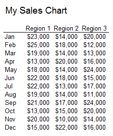
The provided Excel template allows for a systematic approach in presenting sales data. In this example, we created a chart to present sales data from three different regions for an easy comparison.
Key Features
- Supports more than three regions; you can expand to view sales data by:
- Sales reps
- Product lines
- Customer segments
- Various service offerings
Example Image of the Sales Chart:
Customizing Your Sales Charts
To tailor this Excel chart template to your needs, download it and replace the sample data with your own metrics. Here’s how you can do it efficiently:
- Download the template.
- Open the file in Excel.
- Replace the dummy data with your sales figures.
- Customize colors and styles as per your preference.
This template is perfect for reporting on multiple KPIs or metrics. To report on more than 3-5 sales KPIs, consider our Excel Dashboard Templates for comprehensive reporting tools.
Industry-Specific Examples
Let’s look at how different industries can utilize Sales by Region Charts:
- Retail: Analyze sales performance by geographic regions to optimize stock distribution.
- Real Estate: Identify area-specific trends in housing sales.
- Manufacturing: Assess sales performance by production facilities across regions.
Essential Tools for Action
To help you implement these concepts effectively, consider the following tools:
- Checklist: Ensure you have the right data before creating your chart.
- Step-By-Step Guide: Use this process to create your customized Sales by Region Chart:
| Step | Action |
|---|---|
| 1 | Download Excel template. |
| 2 | Input your sales data. |
| 3 | Customize appearance. |
| 4 | Analyze and report insights. |
By utilizing this systematic approach to reporting sales, you will enhance your ability to make data-driven decisions across your organization.
Conclusion
For in-depth data visualization and analysis of your sales metrics, explore our resources such as the Excel Dashboard Templates. Equip yourself with the right tools and templates to strengthen your sales reporting capabilities.
Final Thoughts
Creating effective sales charts is a key aspect of understanding your business’s performance. Leverage this Sales by Region Chart template and maximize your sales reporting capabilities today!


