Simplify Your Quality Reporting with Excel Templates
Quality reports play a vital role in any business by providing a clear snapshot of a product’s or operation’s quality. Whether launching a new product or tracking an existing one, a well-designed quality report in Excel helps identify defects, monitor trends, and ensure compliance with standards.
What is a Quality Report?
A quality report is a concise document summarizing the results of quality inspections or tests. It highlights issues detected, tracks performance metrics, and guides improvement efforts.
Typically, a quality report includes:
- Detailed descriptions of product defects and issues
- Comparative analysis with competitor products or past data
- Test results and data summaries
- Actionable recommendations for quality improvement
Why Use Excel for Quality Reporting?
Excel is one of the most accessible and flexible tools for creating quality reports. Its versatility allows businesses of all sizes to customize reports without needing expensive software.
- Design custom templates tailored to your unique inspection criteria
- Import raw data easily from production or inspection systems
- Use formulas, pivot tables, and conditional formatting to analyze trends
- Create visual dashboards with charts and graphs for quick insights
- Share and collaborate securely with team members and stakeholders
How to Create a Quality Report Format in Excel: Step-by-Step Guide
This beginner-friendly guide walks you through creating a practical quality report template in Excel.
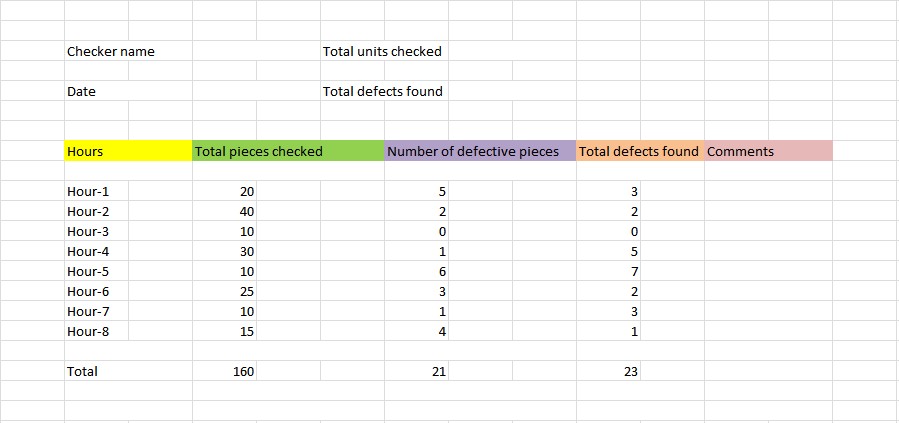
- Step 1: Set Up Your Basic Template Columns
Start a new Excel workbook. Create four main columns: Checker Name, Total Units Checked, Date, and Total Defects Found. These columns capture essential inspection details. - Step 2: Add Detailed Inspection Metrics
Add five more columns: Hours, Total Pieces Checked, Number of Defective Pieces, Total Defects Found, and Comments. For hours, list individual working hours (e.g., Hour-1 through Hour-8) and a total. This provides hourly tracking of inspections. - Step 3: Apply Formulas and Formatting
Use Excel’s Autosum to calculate totals for pieces checked and defects found. Apply conditional formatting to highlight cells with issues exceeding thresholds. Make your data easy to read and interpret. - Step 4: Customize Your Report
Modify your report layout based on your industry requirements. Include additional columns as needed, such as defect categories, inspector IDs, or shift details.
Example of a Quality Report Format in Excel
The example below shows a typical daily quality inspection report for parts checked during assembly in a manufacturing environment. It includes hourly assessments and overall defect tracking.
Industry-Specific Examples of Quality Report Formats
- Manufacturing: Include defect types, machine IDs, and batch numbers for traceability.
- Food Production: Add columns for hygiene checks, temperature readings, and expiry date monitoring.
- Software Testing: Track test cases, bug severity, status, and assigned testers alongside dates.
Tailoring the Excel template to your industry enhances reporting accuracy and usefulness.
Best Practices for Effective Quality Report Formats in Excel
- Keep it Simple: Use clear headings and avoid overcomplicating the report.
- Use Clear Language: Avoid jargon to ensure all readers understand the report.
- Leverage Visuals: Use charts and conditional formatting to highlight key findings.
- Maintain Data Accuracy: Validate inputs using dropdown lists or data validation rules.
- Collaborate and Update: Regularly review the template with stakeholders to improve its relevance.
Free Quality Report Templates in Excel
To save time, use free, customizable Excel templates designed specifically for quality reporting. These templates are easy to adapt for different business needs and streamline report preparation.
Sample Simple Quality Report Template Structure
| Checker Name | Date | Total Units Checked | Hours | Total Pieces Checked | Defective Pieces | Total Defects Found | Comments |
|---|---|---|---|---|---|---|---|
| John Doe | 2025-03-20 | 500 | 8 | 480 | 15 | 20 | Increased defects in Hour 5 |
Step-by-Step Quick Recipe for Creating Your Quality Report in Excel
- Open a new Excel workbook and label columns as per your reporting needs.
- Input sample data from your daily inspections.
- Apply Autosum and conditional formatting for totals and alerts.
- Create charts to visualize defect trends over time.
- Save your template for recurring use and share with your quality team.
Use this structure to customize and enhance your own reports.
Additional Resources for Business Reporting Improvement
Improve your overall reporting process using strategic Excel tools such as our Automated Excel Reporting template. Automate data collection and reporting for increased efficiency. Likewise, explore financial templates like the Financial Statements Templates to complement quality data with financial insights.
Quality reports are just one part of effective business management. Strengthening your reporting toolkit boosts decision-making and continuous improvement.
For a comprehensive system that drives business growth, consider also Small Business Growth Strategy Pack. It integrates quality, financial, and marketing planning tools to accelerate success.
Start refining your quality reports today by downloading our free Excel templates and exploring these productivity enhancing resources.
Suggested Tags:
- Quality Reporting
- Excel Templates
- Quality Control
Category:
Excel
Summary Checklist: Building Your Quality Report Format in Excel
| Action | Details | Example |
|---|---|---|
| Define Report Scope | Identify key metrics, inspection points, and audience. | Parts defects during assembly inspection. |
| Set Up Columns | Include Checker Name, Date, Units Checked, Defects. | John Doe, 2025-03-20, 500 units, 20 defects. |
| Add Hourly Breakdown | Track defects by work hour for trend analysis. | Hour 1: 2 defects, Hour 5: 7 defects. |
| Use Excel Tools | Autosum, conditional formatting, charts. | Sum defects; highlight rows with >5 defects. |
| Customize & Collaborate | Adjust template for team feedback and specifics. | Add defect categories or shift info. |
| Save & Reuse | Keep template updated and accessible. | Store on shared drive or cloud. |


