Your KPI Dashboard: The Executive Control Panel for Smarter Decisions
You have key performance indicators. You likely have reports. But if you are not using a well-designed KPI dashboard, you are flying blind. You are making decisions based on yesterday’s news, gut feelings, or incomplete data.
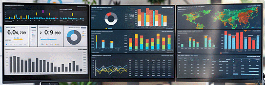
A KPI dashboard is not just a pretty screen with charts. It is a strategic tool. It is the control panel for your entire operation.
Think of it like the dashboard in your car. You don’t need to open the hood to check the oil while driving. You don’t need to get out and measure your speed. A quick glance gives you everything you need to know to drive safely and efficiently.

A business KPI dashboard does the same thing. It takes the most important signals from across your company and puts them in one place, in real-time. This changes everything.
The Real Purpose: From Data to Direction
Many executives think a dashboard’s purpose is to report on the past. That is only a small part of it. The true purpose of a modern KPI dashboard is to guide future action.
1. It Creates a Single Source of Truth
How much time does your leadership team waste debating whose numbers are correct? Sales has one number, finance has another.
A dashboard ends this. It pulls data directly from your source systems and presents one version of the truth. This alignment alone can save hours of meeting time and political friction. It ensures everyone is working from the same playbook.
2. It Translates Strategy into Daily Reality
Your company has a strategic plan. But does your team know how their daily work contributes to it?
A dashboard makes the connection clear. When you post a dashboard that shows top-level goals—like revenue, customer satisfaction, and operational efficiency—you are showing every employee how their performance moves those needles. It turns abstract strategy into something tangible that people can impact every day.
3. It Shifts You from Reactive to Proactive
Without a dashboard, you are often reacting to problems. A big customer cancels, and you scramble. A project goes over budget, and you find out too late.
A good dashboard uses leading indicators.
These are KPIs that predict what will happen. For example, a drop in your ‘sales pipeline growth’ is a leading indicator of future revenue trouble. A rise in ‘employee turnover rate’ can predict a drop in productivity and quality. Seeing these signals early gives you time to correct course before a small issue becomes a crisis.
The Tangible Benefits You Can Take to the Bank
The purpose of a dashboard is powerful, but the benefits are what impact your bottom line. This is where you see the real return on investment.
Benefit 1: Dramatically Faster Decision-Making
Executives cannot afford to wait for a weekly report to make a decision. A live dashboard gives you the information you need right now. Imagine seeing a sudden dip in website traffic from a key region.
With a dashboard, you see it immediately. You can instantly message your marketing team to investigate a possible technical issue or competitive move. Without a dashboard, you might not notice for days.
Action: Identify one decision you made last week that was delayed by lack of data. How would having that data on a dashboard have changed your speed and confidence?
Benefit 2: Uncover Hidden Relationships
Data in separate silos tells a limited story. The magic happens when you bring it together. A dashboard can reveal connections you would never see otherwise.
For example, you might see that when your ‘on-time delivery rate’ (an operations KPI) improves, your ‘Net Promoter Score’ (a customer service KPI) goes up two weeks later.
This proves that operational excellence drives customer loyalty. This insight allows you to confidently invest in logistics improvements, knowing the exact return on customer satisfaction.
Benefit 3: Empower Your Team with Accountability
A transparent dashboard creates a powerful culture of accountability. When team goals and current performance are visible to everyone, it fosters healthy ownership. The sales team can see their progress toward quota. The operations team can monitor their quality metrics. They don’t need a manager to tell them how they are doing; the dashboard shows them. This frees you from micromanaging and allows you to lead.
Building a Dashboard That Actually Works
Many dashboard projects fail. They become cluttered, confusing, and unused. To avoid this, follow these rules.
Rule 1: Know Your Audience
A one-size-fits-all dashboard does not work. The CEO, a department head, and a team lead need different information.

Executive Dashboard: Focuses on 5-7 high-level strategic KPIs across the entire business. Think revenue, profit, customer satisfaction, and employee engagement.
Departmental Dashboard: Dives deeper into one area. A sales dashboard shows pipeline value, conversion rates, and average deal size.
Operational Dashboard: Shows real-time process metrics, like units produced per hour or current customer service wait times.
Action: Before you build, ask: “Who is this for and what one decision do they need to make?”
Rule 2: Focus on the Vital Few, Not the Trivial Many.
The biggest mistake is putting every possible metric on one screen. This creates noise, not insight. Your dashboard should answer critical questions, not all questions.
Stick to the rule of 7. If you have more than 7 key metrics on a single view, you are diluting your focus. Less is more.
Rule 3: Design for Action, Not for Looks
Every element on your dashboard should have a purpose. If you see a KPI trending down, what is the next step? Who is responsible? The design should make problems and opportunities obvious at a glance.
Use color wisely. Green for good, red for bad, yellow for warning. Use charts that are easy to understand—bar charts, line graphs, and simple gauges. Avoid complex charts that need a manual to interpret.
Dashboard Views for Different Leaders
| Dashboard Type | Key Questions It Answers | Example KPIs |
|---|---|---|
| Executive Strategic | Are we achieving our overall goals? | Net Profit, Customer Lifetime Value, Market Share |
| Sales Performance | Are we hitting our revenue targets? | Sales Growth, Pipeline Value, Conversion Rate by Stage |
| Marketing Efficiency | Are we generating leads cost-effectively? | Cost Per Lead, Marketing ROI, Website Conversion Rate |
| Operational Health | Are our processes running smoothly? | On-Time Delivery, Inventory Turnover, Process Cycle Time |
First, gather your leadership team. Write down the 3-5 most critical outcomes you need to achieve this quarter. Then, for each outcome, decide on one or two KPIs that best measure progress.
Next, ask your IT or analytics team to pull these specific numbers into a simple shared screen. This could be in PowerPoint, a tool like Power BI or Tableau, or even a well-formatted shared document.
The goal is not perfection. The goal is to start making decisions with a clear, shared view of your business. The moment you see your entire operation on a single screen, you will have your “aha” moment. You will see the connections, spot the trends, and feel back in control of the driver’s seat.


