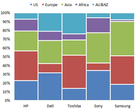
What Is a Marimekko Chart?
A Marimekko chart (also called a mosaic plot) displays data as a series of equally‑high columns that are divided into segments of varying width and height. The visual effect resembles the bold patterns of the Finnish textile brand Marimekko, which is why the chart type carries that name.
Why Use a Marimekko Chart in Excel?
- Market‑share comparison: Show how different product lines or regions contribute to total revenue.
- Portfolio analysis: Visualise profit vs. sales volume across multiple business units.
- Quick visual impact: Convey complex proportional data in a single, easy‑to‑read graphic.
Step‑by‑Step Guide: Build a Marimekko Chart in Excel
- Prepare your data in a flat table. Use one column for the category (e.g., product line) and additional columns for each segment (e.g., market share percentages).
- Select the table and insert a 100 % Stacked Column chart (Insert ► Charts ► 100 % Stacked Column).
- Right‑click the chart series and choose Format Data Series. Set Gap Width to
0 %to remove space between columns. - Adjust the Series Overlap to
100 %so each segment sits flush against the next. - Format each segment with distinct colors that reflect your branding or the story you want to tell.
- Add data labels (optional) for segment percentages to improve readability.
- Resize the chart area to fit your report layout and add a descriptive title.
Quick Checklist
| Task | Done? |
|---|---|
| Data table prepared with categories and segment columns | ☐ |
| Inserted 100 % stacked column chart | ☐ |
| Gap width set to 0 % | ☐ |
| Series overlap set to 100 % | ☐ |
| Colors and data labels applied | ☐ |
| Chart title and axis labels added | ☐ |
Industry‑Specific Examples
Use a Marimekko chart to compare how each product category (e.g., apparel, electronics, home goods) contributes to total store sales and the share of each brand within those categories.
Healthcare – Service Line Utilization
Show the proportion of outpatient, inpatient, and telehealth services across different hospital departments in a single visual.
Technology – SaaS Revenue Mix
Illustrate the breakdown of subscription tiers (basic, professional, enterprise) and the relative contribution of each to overall ARR.
Download the Free Marimekko Chart Template
Jump‑start your analysis with a ready‑made Excel template that follows the steps above. Explore our automated Excel reporting tools to further streamline your dashboard creation.
Additional Resources for Excel Professionals
- 101 Ways to Boost Customer Retention & Loyalty
- Financial Dashboard Excel Templates
- Automated Excel Financials Playbook
Ready to Level Up Your Reporting?
Leverage our Automated Excel Reporting Toolkit and turn raw data into compelling Marimekko visualisations in minutes.