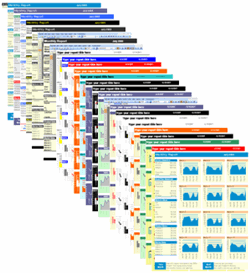
Excel Charts for Management Reports
Excel is the workhorse of modern management reporting. Beyond data entry and calculations, its charting capabilities turn raw numbers into visual stories that executives can act on quickly. Below are the most powerful chart types, practical tips for building them, and industry‑specific examples that show how they can sharpen your reports.

1. Actual vs Target Chart
Shows whether a KPI meets a predefined goal.
- Ideal for sales, production, or budget tracking.
- Use a clustered column chart with a single “target” column in a contrasting colour.
- Add data labels to highlight the variance percentage.
Quick tip: Combine it with conditional formatting to colour‑code “above target” (green) and “below target” (red).
2. Bell Curve (Normal Distribution)
Displays the spread of a data set and identifies outliers.
- Great for quality‑control metrics, test scores, or employee performance ratings.
- Create a histogram, then overlay a smooth line using the
NORM.DISTfunction. - Show the mean and ±1σ, ±2σ lines for quick visual reference.
3. Milestone Chart
Tracks key project or supply‑chain milestones over time.
- Use a stacked bar chart where each segment represents a milestone status (planned, in‑progress, completed).
- Colour each status uniquely to make the timeline instantly readable.
- Link the chart to a dynamic table that updates when milestones are entered.
4. Step Chart
Shows changes that occur at distinct intervals – perfect for interest‑rate hikes, pricing changes, or policy updates.
- Replace a standard line chart with “Step Line” in the chart type menu.
- Mark each step with a data label that includes the effective date.
5. Gantt Chart
The classic visual for project scheduling.
- Build it with a stacked bar chart: the first series hides the start date, the second shows task duration.
- Apply conditional formatting to highlight overdue tasks in red.
- Combine with automated‑excel‑reporting to pull task updates from a master sheet automatically.
6. Sales Funnel
Illustrates conversion stages from leads to closed deals.
- Use a pyramid or stacked bar chart with decreasing widths for each stage.
- Include a “drop‑off” percentage next to each segment.
7. Waffle Chart
A grid‑based alternative to a pie chart that visualises parts of a whole with 100 squares.
- Best for representing market‑share or employee‑skill distribution.
- Create using conditional formatting on a 10 × 10 range and a simple formula to map values to coloured squares.
8. Bullet Chart
Compact performance gauge that compares actual results against target and qualitative bands.
- Replace a cumbersome dashboard with a single‑line visual.
- Use a stacked bar for the qualitative bands and overlay a narrower bar for the actual value.
Industry‑Specific Examples
Healthcare – Patient Wait Times
Combine an Actual vs Target chart with a Bell Curve to monitor wait‑time distribution across clinics. Highlight outliers (≥ 30 minutes) in red and set a target of ≤ 15 minutes.
Manufacturing – Defect Rate Monitoring
Use a Bullet Chart to compare daily defect percentages against a target of 1 % and colour‑code acceptable (green), warning (yellow), and critical (red) zones.
Sales – Quarterly Funnel Review
Employ a Sales Funnel chart to show leads, qualified prospects, proposals, and closed deals. Pair it with a Step Chart to illustrate pricing changes that impacted conversion.
Quick‑Start Checklist for Building Excel Chart‑Based Reports
| Step | Action | Resource |
|---|---|---|
| 1 | Identify the KPI or metric you need to visualise. | Your data source (Excel table, Power Query). |
| 2 | Select the most appropriate chart type from the list above. | Chart‑type guide (this article). |
| 3 | Add data labels, trend lines, and conditional colours for instant insight. | Excel formatting toolbox. |
| 4 | Link the chart to a dynamic table so updates refresh automatically. | Try the automated‑excel‑reporting template. |
| 5 | Export the report to PDF or embed it in PowerPoint for stakeholder meetings. | Built‑in Excel export options. |
Boost Your Reporting Today
Ready to turn these chart ideas into a live dashboard? Grab the Automated Excel Reporting template – a ready‑made workbook that pulls data, refreshes charts, and exports clean management reports in seconds.
For a full‑featured visual toolkit, explore the Financial Dashboard Excel pack and start delivering insight‑driven reports that drive action.


