Excel Speedometer Dashboard: Product Screenshot
The Excel Speedometer Dashboard is a powerful visualization tool designed to swiftly convey performance metrics using dynamic, easy-to-understand speedometer gauges. Ideal for tracking KPIs, sales progress, project completion rates, or operational benchmarks, this dashboard provides clear visual insights to help business professionals make informed decisions.
What is an Excel Speedometer Dashboard?
It is an Excel-based dashboard that uses speedometer or gauge charts to display key performance indicators in a visually appealing and intuitive format. Each dial or gauge represents a metric, allowing users to quickly assess areas performing well and those requiring attention.
Key Features of the Excel Speedometer Dashboard
- Interactive Gauges: Real-time updates as you input data.
- Customizable Ranges: Set thresholds for low, medium, and high performance.
- Multiple Samples Provided: Various screenshot examples indicate adaptability to different metrics.
- User-Friendly Interface: No advanced Excel skills required to update or interpret data.
- Lightweight and Fast: Optimized to work efficiently even with large datasets.
Benefits of Using Speedometer Dashboards in Excel
- Quick Performance Review: Speeds up decision-making by providing visual clarity.
- Improved Communication: Easily explain complex data to teams or stakeholders.
- Flexibility: Suitable for sales tracking, project management, financial reviews, and more.
- Cost-Effective: Leverages Excel, a widely available tool, without expensive software.
Industry-Specific Use Cases
- Sales Teams: Track monthly sales targets vs actual sales.
- Project Managers: Monitor project progress stages visually.
- Finance Departments: Display budget utilization and expense control.
- Customer Service: Measure customer satisfaction or call resolution times.
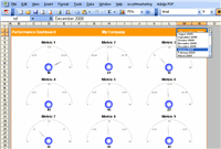
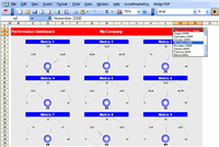
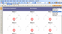
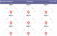
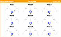
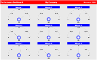
Sample Speedometer Dashboard Screenshots
Below are several samples illustrating various implementations of the Excel Speedometer Dashboard. These examples demonstrate diverse styles and use cases for different performance metrics.
How to Build Your Own Excel Speedometer Dashboard: Step-by-Step Guide
This simple process lets you create speedometer gauges tailored to your business needs.
| Step | Action | Tips |
|---|---|---|
| 1 | Identify Key Metrics | Focus on 3-5 most important KPIs to keep dashboard clean. |
| 2 | Set Performance Ranges | Define thresholds for low, warning, and target zones. |
| 3 | Create Gauge Chart in Excel | Use doughnut + pie chart combo for semi-circle speedometer effect. |
| 4 | Add Dynamic Pointers | Use formulas to move pointer based on metric values automatically. |
| 5 | Format & Customize | Apply consistent colors and labels for clarity and branding. |
| 6 | Test with Real Data | Validate accuracy and readability with your data scenarios. |
| 7 | Share Dashboard | Protect sheets if needed and share with your team for feedback. |
Best Practices for Using Excel Speedometer Dashboards
- Keep the dashboard simple and readable.
- Regularly update data to maintain relevance.
- Use contrasting colors to separate performance bands clearly.
- Combine gauges with complementary charts like trends or tables for deeper insights.
- Keep user interaction intuitive by adding dropdowns or slicers to select data periods.
For those looking to expand their financial and business reporting tools, consider exploring the Automated Excel Financials package. It complements dashboards with automated data integration and comprehensive reports, helping you save time and improve profit insights.


