Discover actionable strategies to enhance your Excel Sales Scorecard and drive better business decisions. Learn how to streamline data, visualize KPIs, and optimize performance tracking for maximum impact.
In today’s data-driven business landscape, an Excel Sales Scorecard is more than just a spreadsheet—it’s a powerful tool for tracking performance, identifying trends, and driving strategic decisions. However, many businesses underutilize this resource due to poor design, cluttered data, or lack of actionable insights. This article provides practical strategies to transform your Excel Sales Scorecard into a dynamic, user-friendly dashboard that delivers real value.
1. Start with a Clear Objective
Before diving into formulas and charts, define the purpose of your sales scorecard. Are you tracking revenue growth, monitoring sales team performance, or analyzing customer acquisition costs? A clear objective ensures your scorecard remains focused and actionable.
Actionable Tip:
- List the key metrics that align with your business goals (e.g., monthly sales, conversion rates, pipeline value).
- Prioritize metrics based on their impact on decision-making.
2. Streamline Your Data Sources
A cluttered scorecard is a useless scorecard. Consolidate your data sources to ensure accuracy and consistency.
Strategies to Streamline Data:
- Automate Data Import: Use Excel’s Power Query to pull data from CRM systems, ERP tools, or other databases directly into your scorecard.
- Clean Your Data: Remove duplicates, correct errors, and standardize formats using Excel’s Data Cleaning tools.
- Centralize Data: Store all sales-related data in a single, master sheet to avoid discrepancies.
3. Design for Clarity and Usability
A well-designed scorecard is intuitive and easy to read. Focus on simplicity and visual hierarchy.
Design Best Practices:
- Use Consistent Formatting: Apply uniform fonts, colors, and cell styles to enhance readability.
- Group Related Metrics: Organize KPIs into logical sections (e.g., revenue, pipeline, team performance).
- Leverage Conditional Formatting: Highlight trends, thresholds, or anomalies with color-coding.
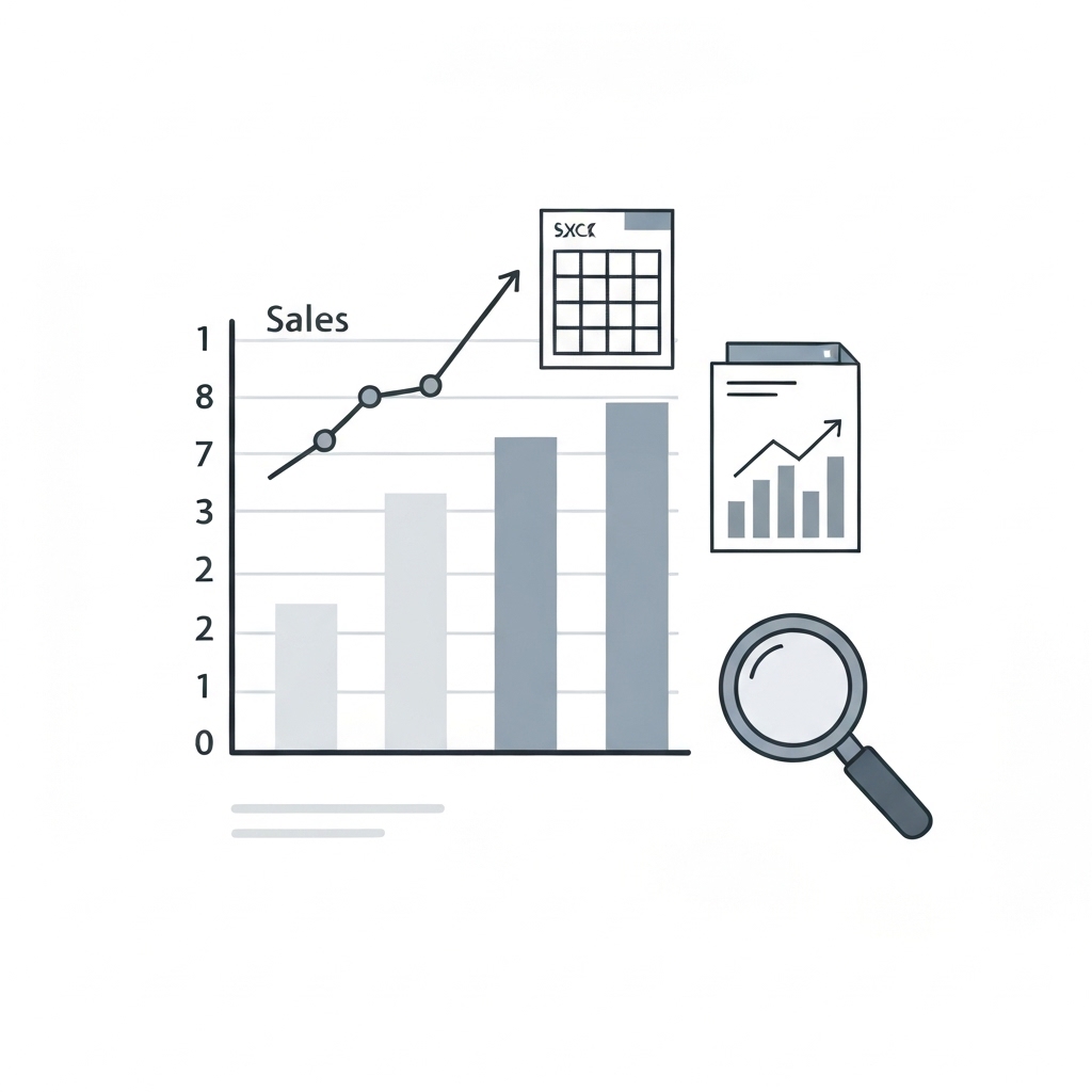
4. Visualize Key Performance Indicators (KPIs)
Data visualization transforms raw numbers into actionable insights. Excel offers a variety of charts and graphs to help you tell a compelling story.
Visualization Tips:
- Bar Charts: Ideal for comparing sales performance across regions or products.
- Line Graphs: Perfect for tracking trends over time (e.g., monthly revenue growth).
- Pie Charts: Useful for showing the proportion of sales by category or channel.
- Sparklines: Add mini-charts within cells to display trends without cluttering the scorecard.
5. Incorporate Dynamic Features
Static scorecards quickly become outdated. Use Excel’s dynamic features to keep your data current and interactive.
Dynamic Features to Implement:
- Dropdown Menus: Allow users to filter data by region, product, or time period.
- Slicers: Provide interactive filters for pivot tables and charts.
- Formulas for Real-Time Updates: Use functions like
VLOOKUP,INDEX/MATCH, orXLOOKUPto pull live data.
6. Track Progress with Comparative Metrics
Context is key. Compare current performance against historical data, targets, or industry benchmarks to identify areas for improvement.
Comparative Metrics to Include:
- Year-Over-Year (YoY) Growth: Measure progress against the same period in previous years.
- Target vs. Actual: Highlight gaps between goals and achievements.
- Benchmarks: Compare your performance against industry standards or competitors.
7. Add Predictive Analytics
Take your scorecard to the next level by incorporating predictive insights. Excel’s forecasting tools can help you anticipate future trends and make proactive decisions.
Predictive Tools to Explore:
- Forecast Sheets: Use Excel’s built-in forecasting feature to predict future sales based on historical data.
- Trendlines: Add trendlines to charts to visualize projected growth or decline.
- What-If Analysis: Use Scenario Manager to model different outcomes based on variable inputs.
8. Ensure Accessibility and Collaboration
A scorecard is only valuable if it’s accessible to the right people. Share your Excel file securely and encourage collaboration.
Accessibility Tips:
- Cloud Storage: Save your scorecard on OneDrive or SharePoint for easy access and version control.
- Permissions: Restrict editing access to prevent accidental changes.
- Training: Provide a quick guide or tutorial for team members to navigate the scorecard effectively.
9. Regularly Review and Update
Your sales scorecard should evolve with your business. Schedule regular reviews to ensure it remains relevant and accurate.
Review Checklist:
- Monthly Updates: Refresh data and adjust targets as needed.
- Quarterly Audits: Evaluate the scorecard’s effectiveness and make design or metric improvements.
- Annual Overhaul: Reassess your objectives and KPIs to align with long-term business goals.
10. Leverage Excel Add-Ins and Templates
Save time and enhance functionality by using Excel add-ins and pre-built templates.
Recommended Tools:
- Power BI Publisher for Excel: Embed interactive Power BI visuals into your scorecard.
- Excel Templates Gallery: Explore free sales dashboard templates for inspiration.
- Third-Party Add-Ins: Tools like XLTools or ASAP Utilities can automate repetitive tasks and enhance data analysis.
Conclusion
An optimized Excel Sales Scorecard is a game-changer for businesses looking to track performance, identify opportunities, and make data-driven decisions. By streamlining data, visualizing KPIs, and incorporating dynamic features, you can transform your scorecard into a powerful tool that drives growth and efficiency.
Start implementing these strategies today, and watch your sales scorecard become an indispensable asset for your team.


