From Gut Feeling to Guided Choice: How KPI Dashboards Power Real Data-Driven Leadership
Let’s be honest. For a long time, many big decisions in business came down to experience, intuition, and the highest-paid person’s opinion.
This is like a ship captain trying to navigate a storm using only a wet finger to test the wind. It might work sometimes, but it’s a huge risk.
Today, that approach is a fast track to being left behind. “Data-driven decision-making” is a popular phrase, but for many executives, it’s still abstract. How do you actually do it? The answer is not in a spreadsheet with 100 tabs. It’s not in a weekly PDF report that lands in your inbox every Monday.

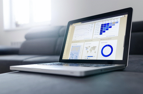
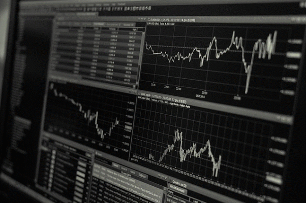
The true engine of data-driven decision-making is a live, well-designed KPI dashboard. It is the difference between guessing and knowing.
The Problem with “HiPPO” Leadership
HiPPO stands for the “Highest Paid Person’s Opinion.” It’s a common culture where the most senior person in the room makes the final call, often overriding the data.
This happens not because leaders are arrogant, but because the right data is hard to find, understand, and trust in the moment.
Without a dashboard, data is:
- Slow: By the time a report is created, the information is already old.
- Siloed: The sales data is in one system, marketing in another, and finance in a third. You never see the full picture.
- Confusing: Raw data is complex. It takes time and skill to turn it into simple insights.
A KPI dashboard fixes this. It turns messy data into a clear control panel. It doesn’t remove your experience or intuition. It gives those qualities a powerful partner: objective, real-time truth.
How a Dashboard Turns Data into Decisions
A dashboard supports better decisions in three specific ways. It acts as a single source of truth, an early warning system, and a connection engine.
1. It Creates a Single Source of Truth
Imagine a meeting where your sales head says revenue is up, but your CFO says cash flow is down. Both are looking at different reports. Time is wasted debating which number is “right.”
A dashboard ends this. It pulls data directly from your core systems and displays it in one place. Everyone – from the CEO to department heads – looks at the same screen with the same numbers. This alignment builds immediate trust. Decisions stop being about whose data is better and start being about what the data means.
Your “Aha” Moment: The next time you walk into a strategic meeting, have the main dashboard displayed.
Start the conversation by saying, “Based on what we all see here, what is our biggest opportunity and our biggest risk right now?” This forces the discussion to be grounded in a shared reality.
2. It Gives You a Real-Time Early Warning System
A static report tells you what happened last week or last month. A live dashboard tells you what is happening right now.

This is the difference between seeing a problem and preventing one.
Think about leading indicators.
These are KPIs that predict future outcomes. For example:
- A drop in website traffic quality can predict a future drop in sales leads.
- A rise in employee turnover in a key department can predict a future drop in product quality or customer service.
- A slowdown in production line speed can predict a future delay in customer deliveries.
A dashboard makes these leading indicators visible. You see the red flag while you still have time to change course. Instead of reacting to a crisis, you proactively manage a situation.
Actionable Insight: Identify one critical outcome for your business, like “Q4 Revenue.” Now, work backward. What 2-3 metrics would act as an early warning that this goal is at risk? Put those front and center on your dashboard.
3. It Reveals Hidden Connections
Data in isolation has limited value. The real power comes from seeing how different parts of your business affect each other. A dashboard can show you these connections instantly.
For example, you might see on your dashboard that every time your “On-Time Delivery Rate” (an operations KPI) dips, your “Net Promoter Score” (a customer KPI) also drops about two weeks later. This isn’t just a guess; it’s a visible pattern.
This insight allows you to make a strategic decision: investing in logistics improvement is directly an investment in customer loyalty and future revenue.
Without a dashboard, these two data points live in different departments. The connection is never made.
| The Old Way vs. The Dashboard Way | |
|---|---|
| The Problem: A Sudden Drop in Sales | |
| Old Way (Without Dashboard) | Dashboard Way (With Dashboard) |
| Week 1: Sales drop noticed in end-of-month report. Meetings are scheduled to investigate. | Day 1: “Sales Conversion Rate” KPI turns red on the dashboard. |
| Week 2: Departments blame each other. Marketing says leads are good. Sales says lead quality is bad. | Day 1: You drill down. You see “Marketing Qualified Leads” are steady, but “Sales Qualified Leads” are down. |
| Week 3: You finally discover a competitor launched a new product a month ago. | Day 1: You spot a correlation: a major competitor’s social media mentions spiked 3 weeks ago. |
| Result: You are 3 weeks behind. You scramble to react. | Result: You identify a potential competitive threat within hours. You can adjust strategy immediately. |
Building a Dashboard That Drives Action

A dashboard full of pretty charts that no one uses is a waste of money. To build one that drives decisions, follow these rules.
Focus on the “So What?”
For every KPI on your dashboard, you must be able to answer one question: “If this number goes up or down, what decision will I make?” If you don’t have an answer, that KPI is just noise. Remove it.
Design for Different Roles
Your head of marketing needs to see a different dashboard than your head of manufacturing. The executive team needs a high-level strategic view. Create tailored dashboards that answer the specific questions each leader is responsible for.
Make it Visual, Not Numerical
The human brain processes visuals 60,000 times faster than text. Use color (red, yellow, green) and simple charts (bar, line) to make the meaning of the data instantly clear. You should be able to understand the story in 5 seconds.
The goal is to make data-driven decision-making the easiest path, not the hardest. When your team has immediate, visual, and trusted data at their fingertips, their conversations change.
They stop asking, “Who thinks…?” and start asking, “What does the data show us?”
The shift starts with a single step. Look at your most important goal today. Then ask yourself: what data, if I saw it right now, would make me more confident in my next decision? That is the first KPI for your dashboard.


