Why Use a Secondary Y‑Axis in Excel?
When you need to compare two data series that have very different ranges, a single Y‑axis can make one series appear flat while the other dominates the chart. Adding a secondary Y‑axis lets each series use its own scale, giving a clear visual comparison.
Step‑by‑Step Guide to Adding a Secondary Axis
Step 1 – Organize Your Data
- Place your categories (X‑axis values) in the first row.
- Enter the first data series in row 2 (primary Y‑axis).
- Enter the second data series in row 3 (secondary Y‑axis).
Example:
| Month | Revenue ($) | Units Sold |
|---|---|---|
| Jan | 120,000 | 1,200 |
| Feb | 95,000 | 1,800 |
| Mar | 130,000 | 1,500 |
Step 2 – Insert a Basic Chart
- Select the entire table.
- Go to Insert → Charts → 2‑D Column. A column chart appears.
Step 3 – Add the Secondary Axis
- Click the chart to reveal the Chart Tools ribbon.
- Choose the data series that should use the secondary axis (e.g., “Units Sold”).
- Right‑click the series → Format Data Series → Series Options → check Secondary Axis.
Excel will instantly add a second vertical axis on the right side of the chart.
Step 4 – Adjust Axis Formats
- Click each axis and use Format Axis to set appropriate minimum, maximum, and number format.
- Match the chart type to the data (e.g., keep columns for revenue, switch the secondary series to a line).
Industry‑Specific Examples
Sales & Marketing
Compare monthly marketing spend (in dollars) with the number of leads generated. The spend axis can be high‑value, while leads are counted in the low‑value range.
Manufacturing
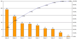
Show production volume alongside defect rate percentages. Volume uses the primary axis; defect rate uses the secondary axis.
Finance
Plot revenue and profit margin on the same chart. Revenue stays on the primary axis; profit margin (percentage) appears on the secondary axis. For a ready‑made financial dashboard, see our Financial Dashboard Excel template.
Tips & Best Practices
- Keep colors distinct. Use a contrasting color for the secondary series.
- Label both axes clearly. Include units (e.g., “$” vs. “Units”).
- Avoid clutter. Show only the most important data points.
- Use line charts for the secondary series. Lines read easier when overlaid on columns.
- Test readability. Print the chart or view it on a small screen to ensure clarity.
Quick Checklist – Adding a Secondary Y‑Axis
| Task | Done? |
|---|---|
| Data arranged with X‑axis row on top. | ✓ |
| Inserted a basic column chart. | ✓ |
| Selected series for secondary axis. | ✓ |
| Enabled secondary axis in Format Data Series. | ✓ |
| Adjusted axis scales & number formats. | ✓ |
| Added clear axis titles and legend. | ✓ |
Enhance Your Reporting Workflow
Want to automate the creation of multi‑axis charts across dozens of reports? Our Automated Excel Reporting toolkit lets you pull data, apply secondary axes, and refresh charts with a single click.
For a one‑page executive snapshot that incorporates secondary‑axis visuals, check out the One‑Page Executive Excel Report Template.
Conclusion
Adding a secondary Y‑axis in Excel transforms confusing charts into insightful visual tools. Follow the steps, apply the tips, and use our ready‑made templates to save time and boost clarity.
Ready to streamline your Excel reporting? Explore the Automated Excel Reporting solution now.