The Power of Visualizing Process Performance
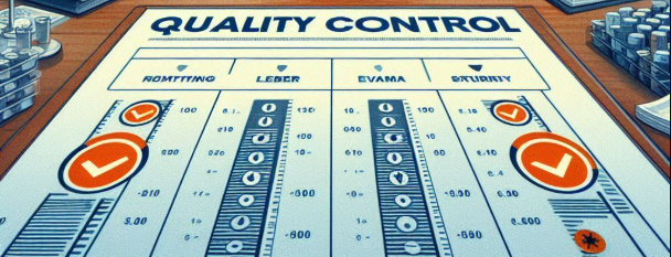
Quality Control Charts are indispensable tools in both manufacturing and service industries. They transform complex process data into visual formats that reveal trends, patterns, and anomalies. This clarity enables organizations to make well-informed, timely decisions to enhance quality and efficiency.
Think of these charts as the dashboard indicators of your process. They provide real-time alerts and historical insights, essential for proactive management. Whether it’s reducing defect rates or stabilizing process variations, understanding these charts deeply can significantly elevate your quality management system.
Types of Quality Control Charts: How to Choose the Right Tool
Different processes and data types require specific charts. Choosing the correct one is crucial for meaningful insights. Here’s a detailed look at the most common types:
1. X-Bar and R Charts: Monitoring Process Means and Range
- X-Bar Charts: Track the average value of a process over time. Useful for detecting shifts or trends in the process mean.
- R Charts: Show the variability within subgroups. They help determine if the process variation remains consistent.
Ideal for continuous data in manufacturing (e.g., dimensions, temperature). Use them together for a comprehensive view of process stability.
2. P and NP Charts: Tracking Defective Items in Attribute Data
- P Charts: Measure proportions of defective units when sample sizes are constant. Monitor for changes in defect rate.
- NP Charts: Track the actual number of defective units when sample sizes vary.
Perfect for inspections where defect detection is binary (pass/fail), such as electronic component testing.
3. C and U Charts: Counting Defects and Nonconformities
- C Charts: Count defects per unit with a fixed sample size.
- U Charts: Count defects per unit when sample size varies.
Typical in industries like automotive manufacturing or quality checking of products with multiple possible defects per item, such as scratches or dents.
4. I-MR (Individual and Moving Range) Charts: For Small Samples and Rare Events
- Individual Charts: Plot single data points to identify outliers, ideal for high-value assets or critical measurements.
- Moving Range Charts: Show the variability between consecutive points, helping detect shifts in process consistency.
Useful in healthcare, high-precision manufacturing, or situations where each data point is vital.
Applying Quality Control Charts to Drive Continuous Improvement
Effective use of these charts can drastically improve process stability and product quality. Here are core benefits:
- Early Detection: Spot process issues before they escalate, minimizing waste and rework.
- Reducing Rework & Waste: Identify process deviations proactively to cut costs and uphold quality standards.
- Data-Driven Decisions: Use visualized process data to optimize operations and resource deployment.
- Promotion of a Culture of Improvement: Regular analysis encourages teams to seek ongoing enhancements.
Global Industry Examples of Quality Control Chart Success
Many top organizations leverage these charts for process excellence:
1. Toyota’s Continuous Improvement Culture
By applying X-Bar and R charts, Toyota maintains top-tier quality in manufacturing. Quick detection of deviations in engine part dimensions or assembly processes ensures reliability and customer satisfaction.
2. Healthcare: Enhancing Patient Safety
Hospitals track medication errors with I-MR charts, reducing incidents and improving patient outcomes. These charts help staff monitor process stability and react swiftly to any unusual trends.
3. Industry-Specific Niche Applications
- Electronics Manufacturing: Using P or NP charts to monitor defect rates in batches of circuit boards.
- Food Production: Employing C or U charts to keep tabs on defects like cracks or contamination on packaging lines.
- Pharmaceuticals: Using I-MR charts for critical process parameters in drug manufacturing.
Implementing a Quality Control Chart System — A Step-by-Step Guide
- Define Your Key Processes: Identify the processes that directly impact quality or output.
- Collect Data: Establish sampling frequency and measurement methods.
- Select the Appropriate Chart: Based on data type (continuous/attribute) and process characteristics.
- Create Control Limits: Calculate upper and lower control limits using historical data.
- Plot Data Regularly: Track real-time process data on the chart.
- Interpret Patterns: Look for signals of variation or shifts — such as points outside control limits, runs, or trends.
- Take Corrective Action: Investigate root causes when signals appear and implement improvements.
- Review & Improve: Continuously refine sampling, measurement, and analysis procedures.
For a practical starting point, a simple control chart template can help organize your data. Use a spreadsheet or free online tools to build your first chart and monitor key metrics.
Where to Find the Right Tools & Resources
Looking to streamline your process monitoring? The customer retention and loyalty strategies pack offers insights into optimizing quality and customer satisfaction through process excellence. To explore a more comprehensive approach to business growth, consider the small business growth strategy pack.
Start integrating these charts today and elevate your quality management practices to the highest standards. Use data as your strategic advantage to stay competitive and customer-focused.
Interested in a simple, effective way to implement control charts? Check out our automated Excel financials and automated Excel reporting tools, designed to make tracking process performance straightforward and scalable.
Ready to take your quality management system to the next level? Discover more about referral and word-of-mouth growth strategies that complement your process improvements.


