As business professionals, we’re continually searching for effective methods to streamline workflows, enhance productivity, and uncover insights that drive informed decisions. Utilizing charts and graphs in Excel is a powerful way to improve reporting and presentations, equipping us with the business insights needed for strategic decision-making. Given the increasing volume of data, leveraging the right tools and techniques is essential. This is where business dashboards and effective charting methods become critical for success.
In this article, we will delve into the world of business charts and graphs, exploring how they simplify complex data, reveal trends, and foster business growth. Additionally, we will discuss the latest advancements in Excel technology, including AI-powered automation, and how these innovations can transform the way we manage data.
Business Charting Tips: Selecting the Right Charts
Charts serve as tools for visualizing data, making business information straightforward and accessible. When creating business reports or presentations, your first step is to choose the right chart format. Here are some tips:
- Identify the key message you want to communicate.
- Understand your audience, ensuring the chart type resonates with them.
- Opt for simplicity; complex charts can confuse rather than clarify.
- If a chart becomes too complex, consider breaking the data into multiple charts or using tables for clarity.
Commonly Used Business Charts
1. Line Chart
Line charts are widely used in business reporting to display trends over time. You can employ line charts to illustrate revenue trends or compare multiple variables over a specified time frame.
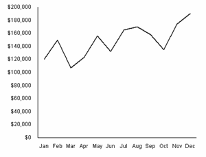
For instance, compare revenue across multiple products over the same period. Tip: Automate the creation of these charts using Excel automation tools, freeing up time for strategic analysis.
2. Column Chart
Column charts effectively demonstrate trends or comparisons over shorter time frames, such as months or quarters. They work well for showing revenue or profit over a specified period.
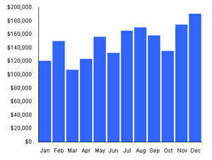
Consider using a column chart for analyzing profit over the last five years. Integrating custom Excel tools allows for tailored solutions to uncover hidden trends.
3. Bar Chart
Bar charts, which display horizontal bars, are excellent for making comparisons, particularly when displaying longer category names.
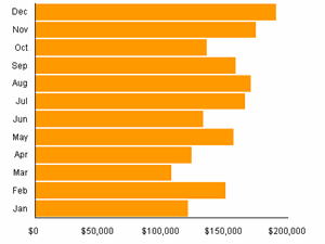
Consider using a bar chart to compare data across different categories, employing AI-driven automation to optimize your chart creation process.
4. Area Chart
Area charts display trends similar to line charts but can show cumulative totals more effectively.

They are beneficial for visualizing the sum of several variables, but too many variables can clutter the area chart, making it hard to read.
5. XY Chart (Scatter Chart)
XY charts show relationships between variables, revealing how strongly they correlate.
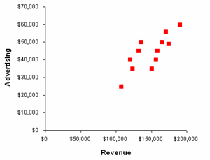
This type of chart can visualize relationships such as customer response times against sales revenue.
6. Radar Chart
Radar charts compare multiple variables on a single chart. They are ideal for gap analysis.

Radar charts allow you to visualize areas where your business excels and where it can improve.
7. Combination Chart
Utility of combination charts lies in their ability to showcase different types of data together.
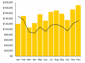
They effectively highlight how two different data sets intersect.
8. Pie Chart
Pie charts are used to show proportions and market shares. They’re simple yet effective for conveying quick insights.
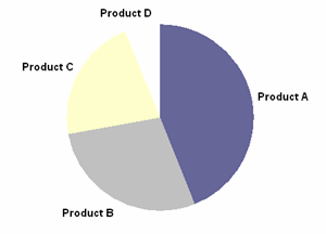
Remember, pie charts are most effective with a limited number of categories.
9. Histogram Chart
Histogram charts summarize the frequency distribution of a dataset. They clearly illustrate variations over specified intervals.
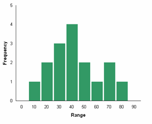
By using histogram charts, you can visualize large amounts of data easily.
10. Pareto Chart
Based on the Pareto Principle, this chart helps prioritize categories based on significance, integrating a line chart for cumulative percentages.
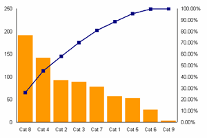
Pareto charts assist in identifying key opportunities for improvement.
Transforming Raw Data into Actionable Dashboards
Transforming raw data into actionable insights is fundamental to effective business management reporting. Business dashboards powered by well-chosen charts can elevate your strategic decision-making. Leveraging Excel automation can optimize the data analysis process, allowing for the creation of interactive dashboards that evolve with your data.
Quick Reference Tools
- Chart Selection Checklist:
- What is the data type?
- What do you want to highlight?
- Who is your audience?
- Is simplicity prioritized?
- Will you automate?
For further assistance with Excel automation and dashboard creation, consider exploring our intelligent solutions for businesses. Optimize your data insights with ease and flexibility.
Related Resources
Explore additional resources to enhance your business approach:


