Executive Summary
Manufacturers need KPI reporting that is timely, relevant, and easy to act on. This article translates the core idea that KPI selection, data access, and storytelling with dashboards into practical steps you can implement today to improve operations and decision making.
Why KPI reporting often lags in manufacturing
Many organizations rely on static or delayed reports, which impede fast decisions. Real-time data access and well-chosen KPIs are essential for spotting trends, root causes, and opportunities to improve quality and cost. The result is a production environment where leadership sees the right data at the right time, reducing firefighting and accelerating improvement cycles.
Define a one-page KPI framework you can trust
Anchor your KPI set to strategy with a small, baseline portfolio and a clear governance process. A practical approach includes:
- Current performance: the latest value for each KPI, typically monthly or quarterly.
- Performance trend: a simple visual showing movement over the last four quarters or sprints.
- Driver context: a short note on the underlying factors driving the change (e.g., machine downtime, changeovers, supplier delays).
Keep the KPI count manageable (e.g., 6–12 for a plant, 15–25 for a value stream) and ensure each KPI ties to a specific business question.
Choose KPIs with data discipline, not wishful thinking
KPIs should be tied to data you can reliably collect and verify. Align stakeholders early to ensure the measures reflect strategic intent and operational reality. Regular re-evaluation is essential as processes and goals evolve. A practical rule: if a KPI can’t be measured within a defined data collection window, either adjust the definition or replace it with a proxy that is measurable and meaningful.
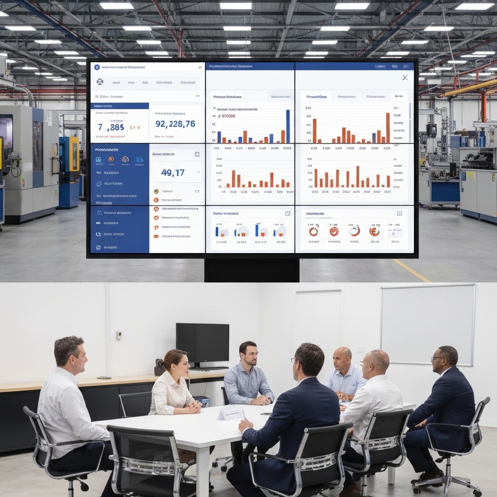
From static reports to dynamic dashboards
Dashboards that tell story through context outperform static PDFs. Focus on features that enable quick interpretation:
- Visual cues for performance vs. targets and historical trends.
- drill-down capabilities to identify root causes (e.g., shift, line, batch).
- Alerting when a KPI deviates beyond a threshold.
Remember: dashboards should answer questions, not just present numbers. Use a narrative approach to guide decision makers from observation to action.
Practical dashboard design patterns for manufacturers
Adopt patterns that support daily operations and continuous improvement:
- Line-of-business view: Overall Equipment Effectiveness (OEE), yield, scrap rate, and downtime by line.
- Quality and compliance view: first-pass yield, defect types, andCAPA status.
- Supply chain view: supplier on-time delivery, material availability, and buffer levels.
In each pattern, include current value, trend, and a short narrative on what to do next. This structure makes dashboards actionable instead of merely informative.
How to implement quickly: an action plan
Follow a simple action plan to get measurable value fast:
- Step 1: Map decisions to 6–12 core KPIs. Ensure each KPI has a data source, owner, and update cadence.
- Step 2: Build a live data pipeline where possible, or automate monthly data refreshes. Prioritize data quality checks at source.
- Step 3: Create a dashboard prototype with current values, trends, and quick actions. Share with frontline managers for feedback.
- Step 4: Install lightweight alerts for any KPI crossing thresholds critical to safety, quality, or throughput.
- Step 5: Establish a quarterly review process to revisit KPI relevance and adjust targets based on new capabilities or constraints.
Definitions and formulas you can reuse
Use simple definitions to avoid ambiguity:
- OEE = Availability × Performance × Quality
- Yield = Good Units / Total Units Produced
- Scrap Rate = Scrap Units / Total Units Produced
Link each metric to a decision rule. Example: if OEE drops below 85% for two consecutive weeks, trigger a root-cause analysis and a standardized response playbook.
Governance and data quality matters
KPIs lose value without trustworthy data. Implement data lineage, owner accountability, and regular data quality checks. Document KPI definitions in a living glossary and standardize naming conventions across plants to prevent confusion.
What to watch for: common pitfalls
Avoid overloading dashboards with vanity metrics or creating a single source of truth that nobody uses. Resist chasing perfect accuracy at the expense of timeliness. Instead, balance data quality with the need for timely insights that drive action.
What’s next: scaling KPI reporting across facilities
As you scale, standardize KPI definitions and dashboard templates. Create a center of excellence for KPI governance that supports multiple plants and regions. This accelerates learning and ensures consistency in how performance is tracked and improved.
Takeaways you can implement this week
1) Limit KPI set to a strategic core. 2) Build a live or near‑live data stream for those KPIs. 3) Create dashboards with current value, trend, and action cues. 4) Establish a quarterly KPI review cadence. 5) Implement alerts for critical deviations to enable quick response.
Close: your one-step action plan
Start today by selecting 6–12 core KPIs, map data sources, and create a pilot dashboard for one production line. Use that pilot to refine definitions, data quality checks, and alert rules. Roll out the improved framework to additional lines once the pilot meets target readiness.


