Creating Metrics in Microsoft Excel: Essential Guide for Managers
Tracking meaningful metrics is critical for the success of every manager. One of the most powerful and accessible tools for designing effective data visualizations is Microsoft Excel. With Excel dashboards, you can customize virtually any metric tracking system to fit your unique needs or the preferences of your stakeholders.
The Power of Excel Dashboards
Excel dashboards are flexible and intuitive. You can decide exactly how your dashboard looks and which metrics to include. As you visualize your data, keep in mind the entire process:
- Data Acquisition: How to load your data into Excel.
- Data Management: Techniques to clean, organize, and prepare data.
- Dashboard Linking: Connecting your data with charts, tables, and dashboard elements.
- Report Design: Building an engaging and actionable dashboard report.
Bringing Data into Your Excel Dashboard
While Excel is flexible, effective data entry goes beyond pasting data and inserting charts. One best practice is to connect your Excel workbook directly to external data sources instead of manually entering data. This connection method ensures your dashboards update automatically when your source data changes.
Using Data Connections and ODBC
Excel supports connections via Open Database Connectivity (ODBC). ODBC links Excel to databases such as SQL Server, Access, or cloud data platforms. Properly setting up this connection will enable dynamic data refreshes when underlying data changes.
Important tips when importing data:
- Maintain minimal and relevant data to optimize performance.
- Exclude redundant or irrelevant data to keep files manageable.
Data Import Methods: Flat Files vs. Pivot Tables
You can import data either as flat files or use pivot tables:
- Flat Files: Smaller and simpler, but involve complex formulas for data retrieval and calculations.
- Pivot Tables: Larger file size but faster calculation and easier data summarization.
For most business dashboards, synchronizing multiple pivot tables with the same data source and using slicers for filtering offers the best combination of speed and interactivity.
Managing Data and Connecting to Dashboard Objects in Excel
Once data is imported, the next step is managing it for dashboard display.
Formulas and Functions for Dashboard Users
Depending on your data structure:
- Pivot Table Users: Extract data efficiently with the
GETPIVOTDATAfunction. - Flat File Users: Use formulas like
DSUM,DGET,VLOOKUP,MATCH,INDEX,SUMIF, andSUMPRODUCT.
Note: Keep formulas simple and minimal to reduce errors and improve workbook maintenance. Pivot tables naturally limit the need for complex formulas.
Documenting Work with Named Ranges
Named ranges enhance formula readability and simplify data management. Using named ranges allows users to better explore the dashboard and understand the data sources behind metrics.
Dynamic Ranges and Interactive Dashboards
To build interactive dashboards, dynamic ranges are essential. The OFFSET function can create expandable ranges that adjust automatically as new data is added.
For more advanced automation, record macros that loop through cells or ranges using FOR NEXT or FOR EACH loops. This facilitates dynamic updates and interaction in your dashboards.
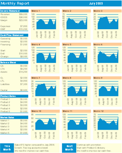
Industry Applications: Metrics Dashboards for Business Professionals
Excel metrics dashboards are widely used across industries. Here’s how you can tailor your metrics for specific needs:
Sales and Marketing
- Track sales conversion rates, lead generation, and campaign effectiveness.
- Use slicers to filter data by region, product, or sales representative.
Financial Management
- Monitor financial KPIs such as revenue growth, expenses, and profit margins.
- Build visualizations like waterfall charts and variance analyses.
Human Resources
- Measure employee retention rates, time to hire, and training impact.
- Utilize pivot tables to analyze staff turnover by department or role.
Operations and Project Management
- Track project progress, resource utilization, and cycle times.
- Combine Gantt charts with key metrics for holistic project dashboards.
Step-by-Step Guide for Creating Metrics in Excel Dashboards
| Step | Action | Tip |
|---|---|---|
| 1 | Identify Key Metrics | Align with business goals and stakeholder needs. |
| 2 | Connect Data Source | Use Data > Get & Transform or ODBC connections. |
| 3 | Prepare and Clean Data | Remove duplicates, filter unwanted data, format properly. |
| 4 | Create Pivot Tables or Define Formulas | Choose pivot tables for fast, flexible analysis. |
| 5 | Build Dashboard Elements | Insert charts, slicers, and dynamic tables accordingly. |
| 6 | Use Named Ranges and Dynamic Ranges | Enhance clarity and enable interaction. |
| 7 | Test and Refresh Data | Verify calculations and visualizations update correctly. |
Tips for Maintaining Excel Metrics Dashboards
- Keep formulas simple and minimize dependencies.
- Regularly update and document named ranges.
- Back up your dashboard files and maintain version control.
- Use consistent formatting to improve readability.
- Train users on interacting with slicers and filters.
Additional Resources to Enhance Your Excel Metrics Dashboards
For more advanced templates and tools to improve your Excel dashboards, explore our automated reporting and financial dashboard resources:
- Automated Excel Reporting – Streamline your reporting process with ready-to-use automation.
- Financial Dashboard Excel – Pre-built financial KPIs and visualizations to track your business health.
These toolkits can save you time and help you deliver professional-quality dashboards that drive decision-making.
By following these clear, structured steps, you’ll be able to create powerful, actionable metrics dashboards in Excel tailored to your business needs.


