Introduction to Business Report Table of Contents
Download Business Report Table of Contents Templates Free
Business reports are essential tools for effectively communicating important information across an organization. They provide stakeholders and upper management with clear, concise analyses of various business performances. Crafting a professional business report is a skill that you can develop with practice and understanding of proper frameworks.
A well-structured business report typically follows a standardized format that includes a title page, executive summary, table of contents, introduction, body, conclusion, reference list, and appendices.

Why Include a Table of Contents?
A table of contents (TOC) is crucial when your business report is lengthy—generally over 10 pages. It helps readers quickly locate specific information, saving valuable time.
Beyond navigation, a TOC gives readers a preview of the report’s structure and key topics. This is especially important for executives and stakeholders who might have limited time to review detailed reports.
Imagine a lengthy report without a table of contents. It becomes difficult for anyone to quickly jump to sections of interest, decreasing the chances of the report being thoroughly read or understood.
Key Benefits of Including a Table of Contents:
- Improves readability and navigation
- Provides an overview of topics and subtopics
- Makes the report appear more organized and professional
- Helps readers reference specific sections during discussions
Formatting Your Table of Contents
Your TOC should be consistent with the overall style and format of the report. Proper numbering and labeling are essential for clarity and professionalism.
Tips for Effective TOC Formatting:
- Use decimal numbering for sections and subsections (e.g., 1, 1.1, 1.2).
- Include descriptive titles for appendices instead of generic labels like “Appendix 1” or “Appendix 2”. For example, “Appendix 1: Sales Figures (2010-2020)”.
- Number the pages using Arabic numerals for the main content (1, 2, 3…).
- Label preliminary pages such as the title page and executive summary with lowercase Roman numerals (i, ii, iii…).
- Use subtle colors or shading to differentiate the TOC from the body text if appropriate for your format.
Enhancing Your Business Report with Visual Elements
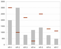
To keep readers engaged, avoid bulky text blocks filled solely with numbers and raw data. Incorporate graphs, charts, and diagrams to illustrate key points and trends.

Visual aids help readers better interpret data and highlight significant findings without overwhelming them.
Tables can also be useful but graphs and charts generally communicate insights more intuitively.
Niche Examples: Industry-Specific TOC Sections
Depending on your industry, your business report’s TOC might require customization to include relevant sections. Here are some examples:
- Marketing Reports: Market analysis, campaign performance, customer segmentation, ROI
- Financial Reports: Income statements, balance sheets, cash flow analysis, financial ratios
- Sales Reports: Sales targets, actual sales data, pipeline summaries, regional performance
- Operations Reports: Production efficiency, quality control, supply chain metrics
Step-by-Step Guide: Creating an Effective Table of Contents for Your Report
| Step | Action | Example |
|---|---|---|
| 1 | Outline your report’s main sections and subsections. | Introduction, Market Overview, Sales Performance, Conclusion |
| 2 | Assign decimal numbers to each section. | 1 Introduction, 2 Market Overview, 2.1 Competitor Analysis |
| 3 | Label appendices descriptively. | Appendix A: Customer Survey Results |
| 4 | Decide on page numbering style for preliminary and main pages. | Title page (i), Executive summary (ii), Body pages (1, 2, 3…) |
| 5 | Format the TOC in your document or presentation software accordingly. | Use consistent fonts, indentation, and spacing |
| 6 | Review and update the TOC as the report is finalized to ensure page numbers are accurate. | Check before publishing or distributing |
Quick Tips to Improve Your Business Reports
- Keep your content clear, concise, and focused.
- Use visuals to complement and explain data.
- Maintain alignment between the TOC and report sections.
- Use templates to save time and maintain professional quality.
Remember, a poorly organized report can discourage even the most interested readers. Investing time in structuring and formatting your report properly elevates your communication effectiveness dramatically.
Enhance Your Reporting with Ready-Made Templates
To streamline your reporting process and maintain professional quality, explore Dashboard KPI Templates. These tools allow you to visualize Excel data clearly, incorporating dynamic tables, charts, and dashboards that make your reports stand out.
Using structured templates for your business report’s table of contents and dashboards will save you time and improve how your information is received and understood.
Summary Checklist for Your Business Report Table of Contents
| Checklist Item | Completed |
|---|---|
| Report formatted with title page, summary, TOC, and proper sections | |
| Table of Contents included for reports longer than 10 pages | |
| Decimal numbering used for TOC items | |
| Appendices labeled with descriptive titles | |
| Page numbering consistent (Roman for preliminaries, Arabic for main content) | |
| Visuals such as graphs and charts integrated within the report | |
| TOC format consistent with overall report style | |
| TOC reviewed and updated after finalizing report content |
Use this guide as a framework for your next business report to ensure clarity, professionalism, and ease of reading.


